T1 Energy,
A giant step forward for domestic energy independence.
Client:
T1 Energy
Year:
2025
Role:
- Creative Direction
- Digital Design
- Visual Identity
- Graphic Design
From energy provider to solar leader, powering 10% of U.S. solar modules.


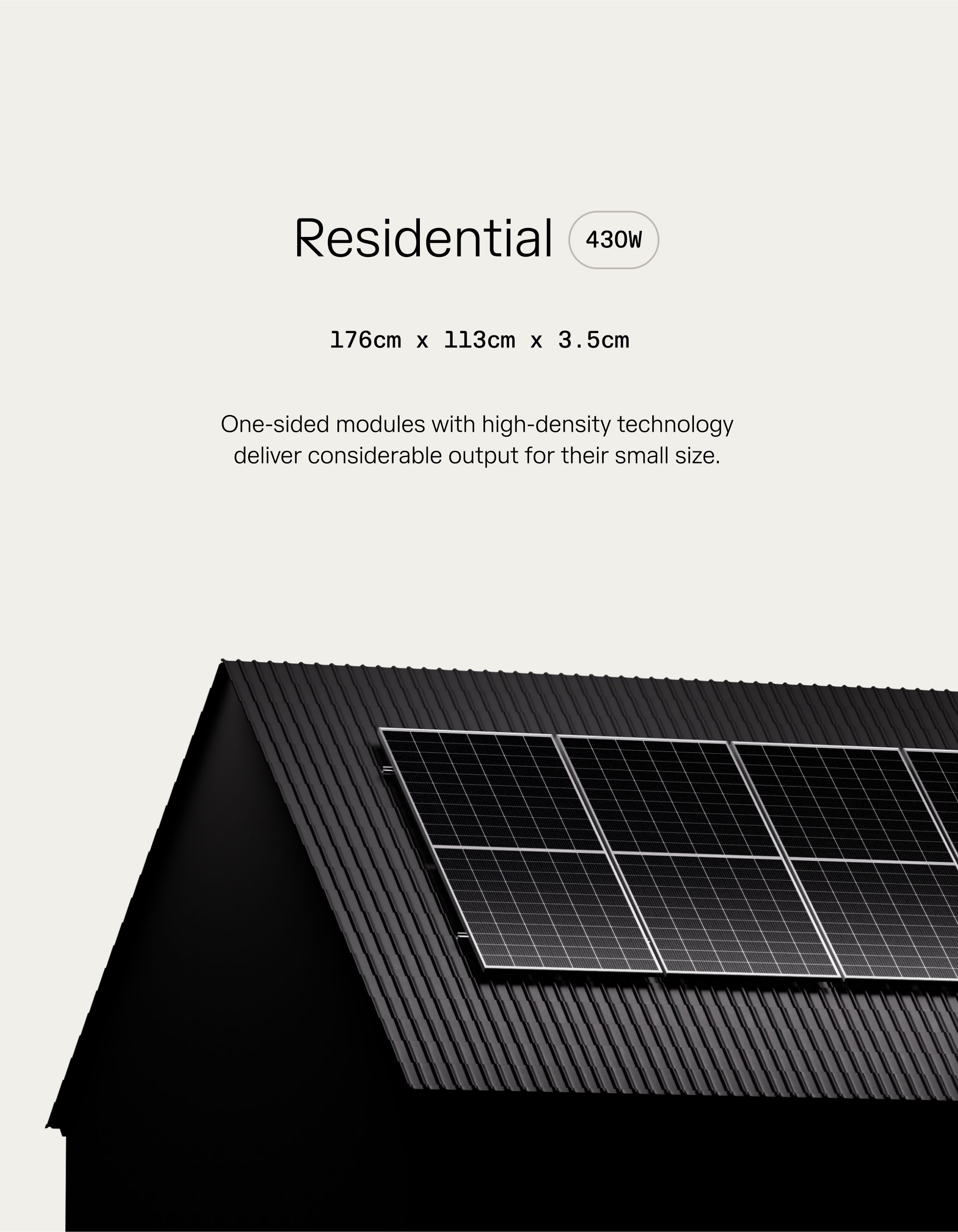

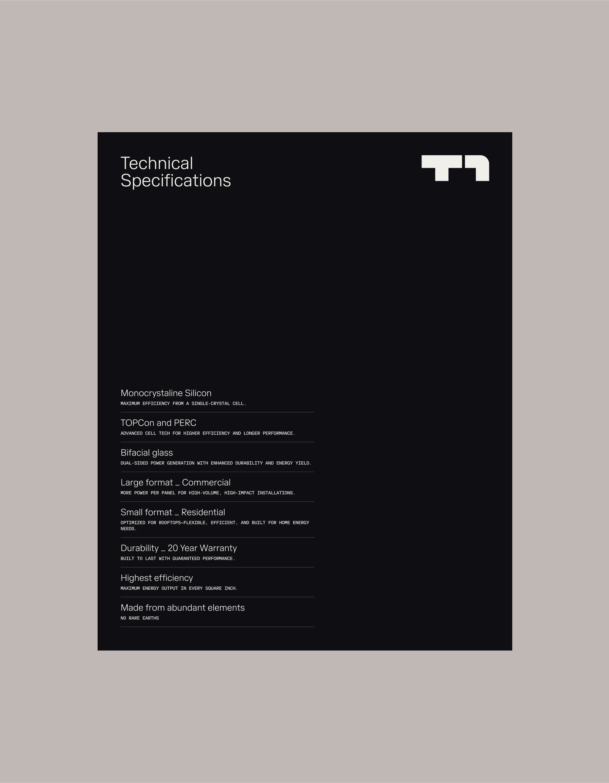
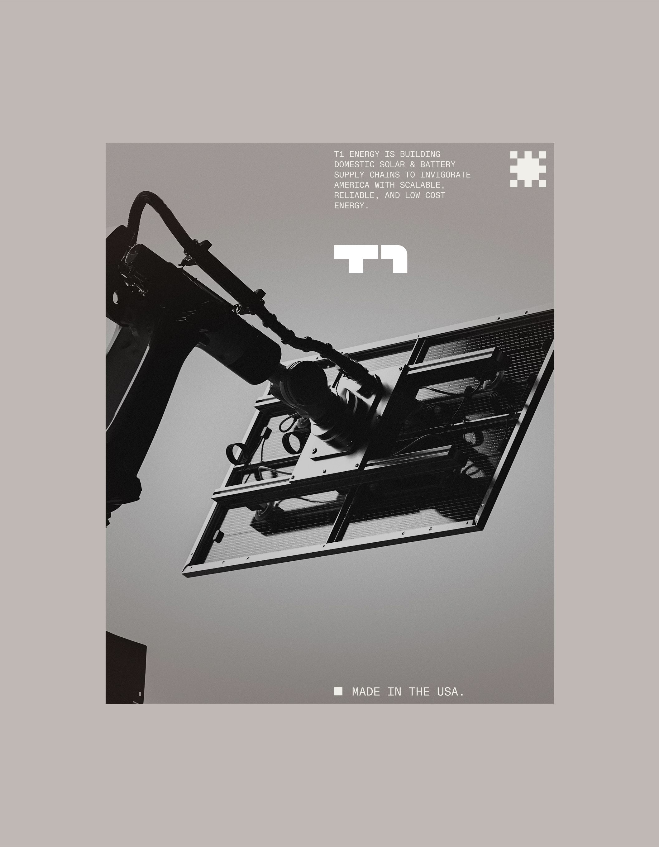
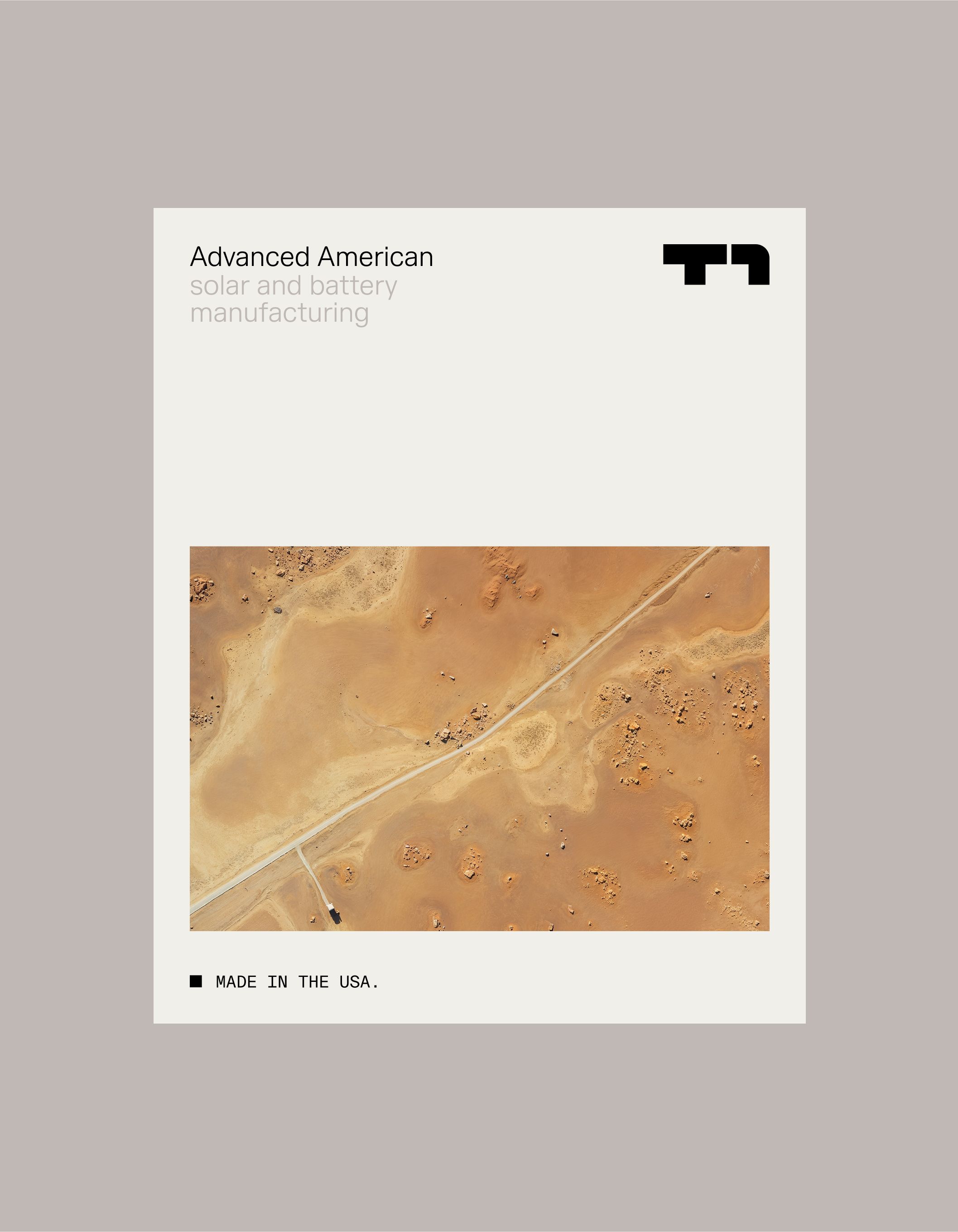

A graphic identity and logomark inspired by our solar energy grids.


Paired with a visual language that brings our manufacturing ingenuity into focus.


Energy is the lifeblood of our civilization. More than 80% of new U.S. electricity capacity in 2024 was solar and batteries. As our markets and wider culture shifts towards sustainability, T1 is aiming to unlock domestic industries with scalable, reliable, low-cost energy.
The energy solutions provider, formerly FREYR Battery (FREY), represents roughly 10% of our domestic solar module capacity. Currently operating out of their G1 Dallas facility, the solar gigafactory produces solar cells for both Commercial and Residential markets.
We partnered with the T1 team to help transition them out of FREYR and into the next life-stage of the growing company. The transition was part of a larger business strategy, one that was set to position them as leaders of renewable energy production.
With the territory, came the need to leave legacy energy behind, and shift towards a more definitive future. At the center of this shift: a new symbol. Constructed from a grid of solar-inspired blocks the mark reflects the qualities that define T1—strength, flexibility, and scale.
The rebrand also introduced T1 Sans, a custom typeface. Observing the letterforms of the brand name, "T" and "1", the team saw a clear opportunity to juxtapose round and sharp edges. The typography presents a clear element of tension that swiftly and seamlessly gets resolved through motion animation.
That transition between round and sharp edges is also experienced through UX details and subtle hover states on the website, which we developed in tandem with the new visual identity. The site brings advanced manufacturing details and expertise through a socially-native lens, making for an experience where education becomes intuitive.
It's visually-led, but informative. Deep with detail, without feeling dense. Messaging shows up where it counts, letting imagery do the heavy-lifting.
T1 sits at the vanguard of our domestic energy supply chains, proof that simplicity doesn't mean saying less, but instead, saying what matters.
- Creative Direction & Design:Mouthwash Studio
- Web Development:Rafa Cobiella
- 3D Rendering:Yuri Roga
- 3D Rendering:Tyler Anderson
- 3D Rendering:Culte Commun (Nikolas Ardeley)
- Type Design:Daniel Wenzel (26A1)
- Logo Design in collaboration with:Moniker
- T1 Creative Director:Nick Bembenek
- Digital Design:Tommy Campbell